Rebranding English in Rural Japan
Experiential Branding | Graphic Design | Visual Storytelling | Education Design | Cultural Exchange
Context & Challenge
As an Assistant Language Teacher in Mine City, a small mountainous town in Yamaguchi Prefecture, I encountered a common challenge: English was often seen by students as a subject without personality. It existed in textbooks, tests, and rote memorization—but rarely in places that felt meaningful or fun.
Events like English Village, seasonal English Clubs, and school-wide language boards offered opportunities to engage students more creatively, but they often lacked a visual or emotional presence that invited students to participate.
The challenge was clear: How do you make English feel exciting, relevant, and worth paying attention to in a rural school setting?
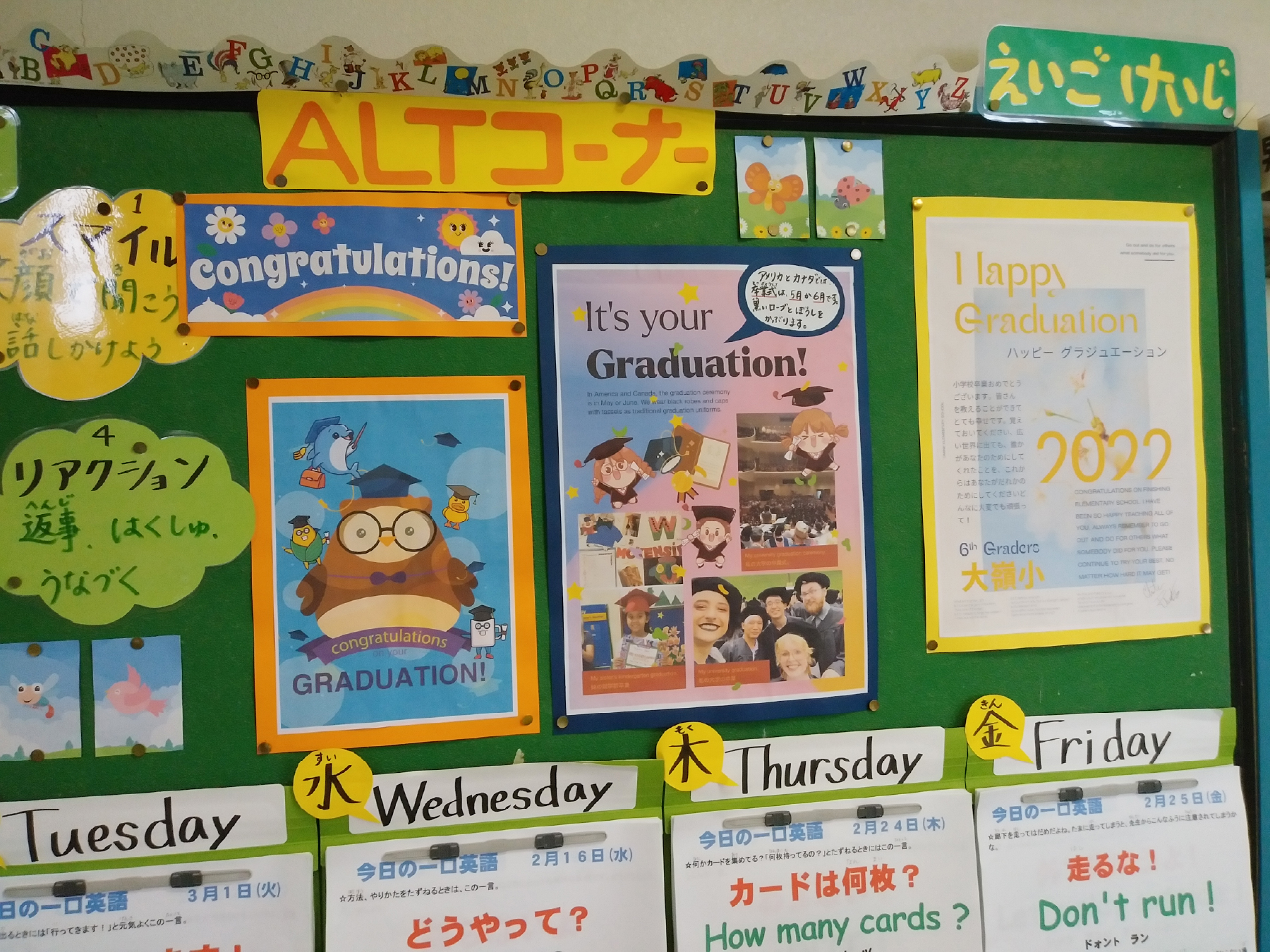
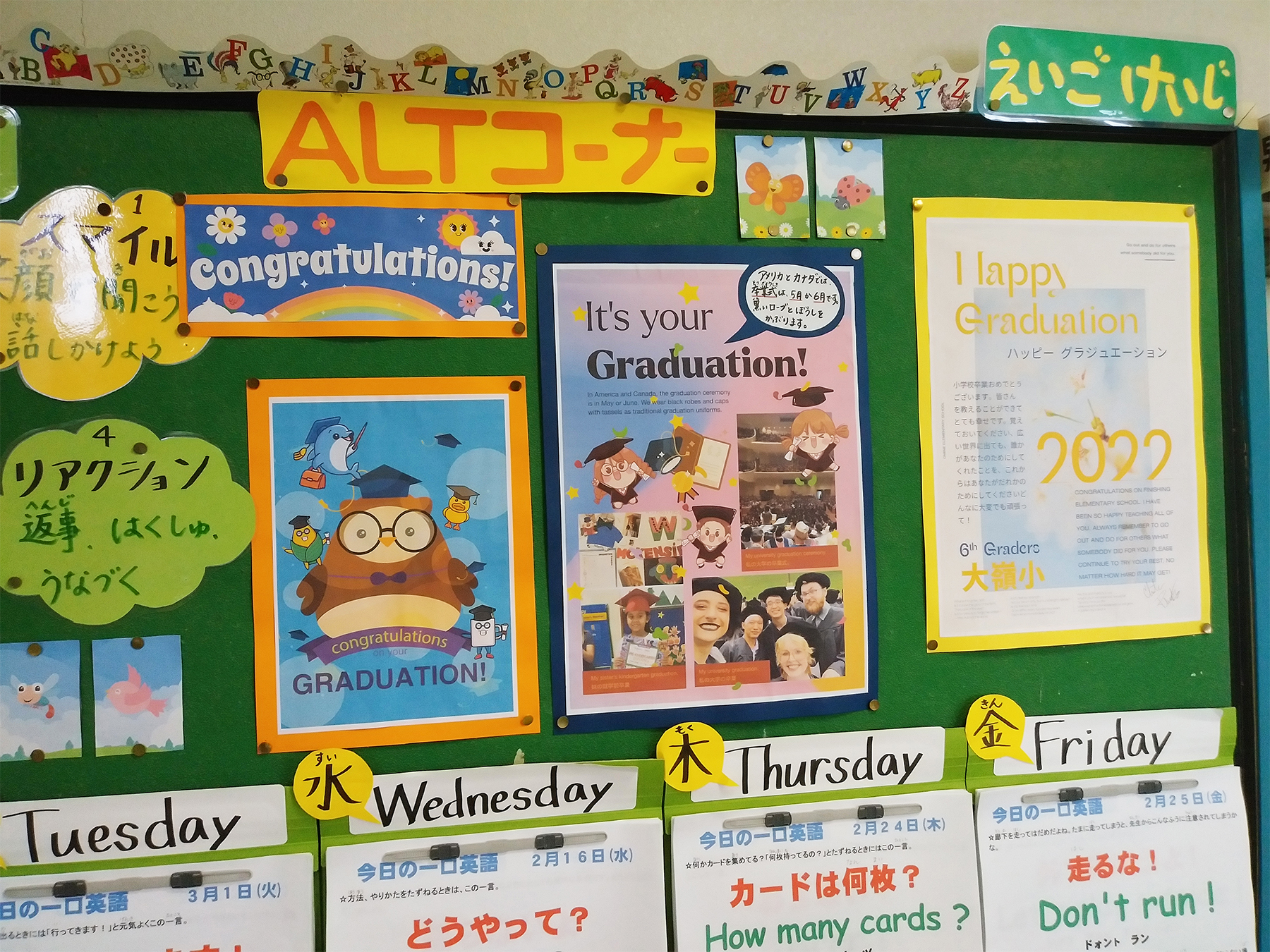
Both teachers and students contributed to exploring international cultures, holidays, and global perspectives through rotating visual displays.
Vision & Goals
My goal was to use design to rebrand English as something approachable, expressive, and full of wonder. The objectives were:
- To spark curiosity through culturally engaging visuals
- To build a recognizable visual identity for English-related events across schools
- To make English feel cool, exciting, and worth talking about
- To support international cultural exchange by showcasing global customs and voices
- To encourage voluntary participation in extracurricular English activities
Design was my way of saying: "This is something different. This is worth your time."
Design Strategy
Instead of building a single, fixed system, I approached each poster and deliverable as an invitation—a small campaign with a unique personality. Over time, these became part of a broader visual language for English events across the city.


🎃 Halloween Event Poster
Using a collage-based approach in Photoshop, I photographed myself and other ALT teachers, then composited us into playful horror scenes. Each poster told a short visual story, usually involving us escaping cute or spooky monsters.
The tone was light and cinematic, with careful lighting and texture choices that felt spooky but approachable. Students found the posters “cute” and “cool,” and many joined because “it looked fun.”
These posters also helped make ALTs feel more relatable, turning us into characters within the school’s shared stories.


🎄 Christmas Event Poster
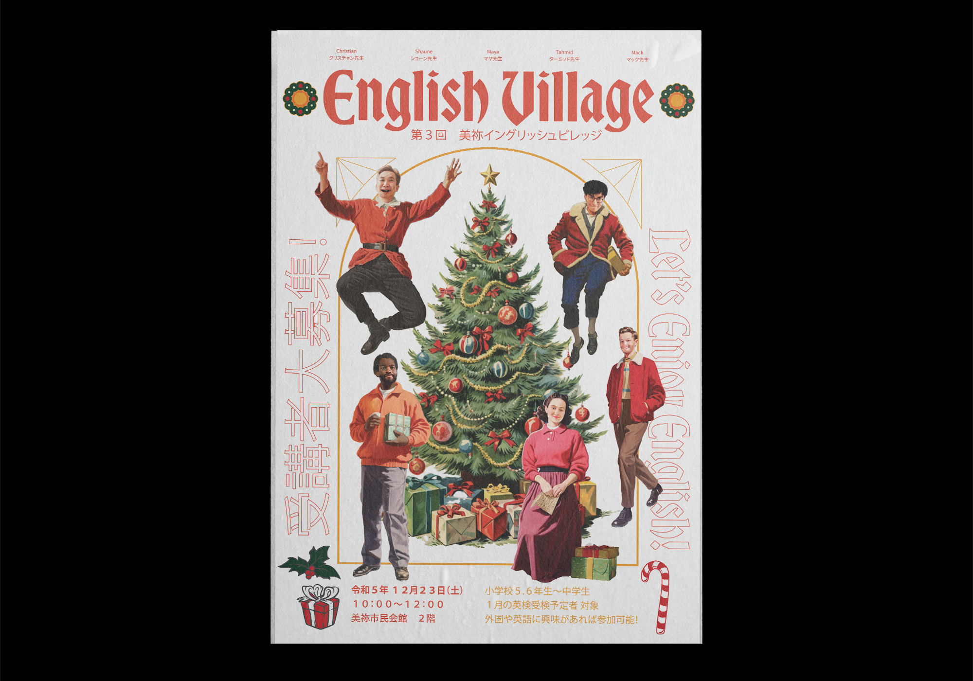
Leaning into nostalgic American holiday aesthetics, I referenced vintage Hallmark cards and storybook illustrations. Warm reds, classic script typography, and soft snowflake textures created a sense of comfort and celebration.
Students who hadn't joined an English Village event before were drawn in by the "cute" and "Christmasy" design.

🏕 English Club & Village Posters
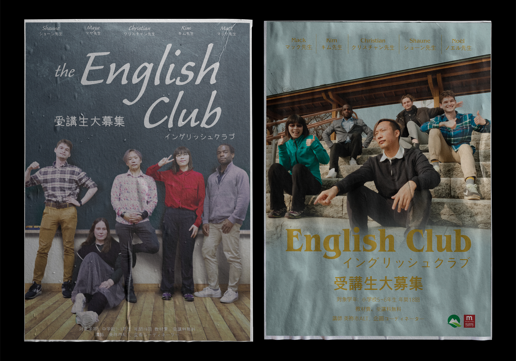
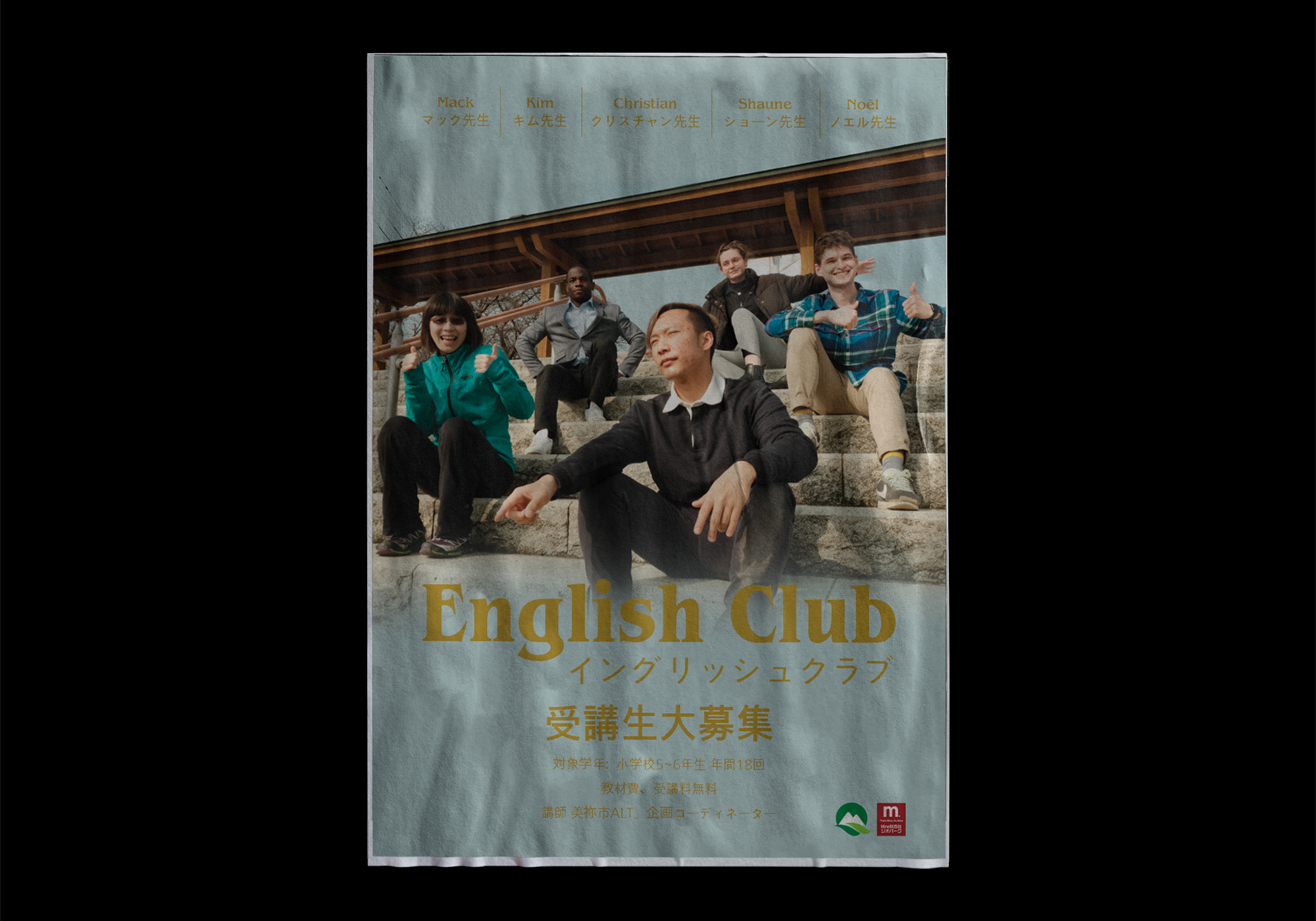
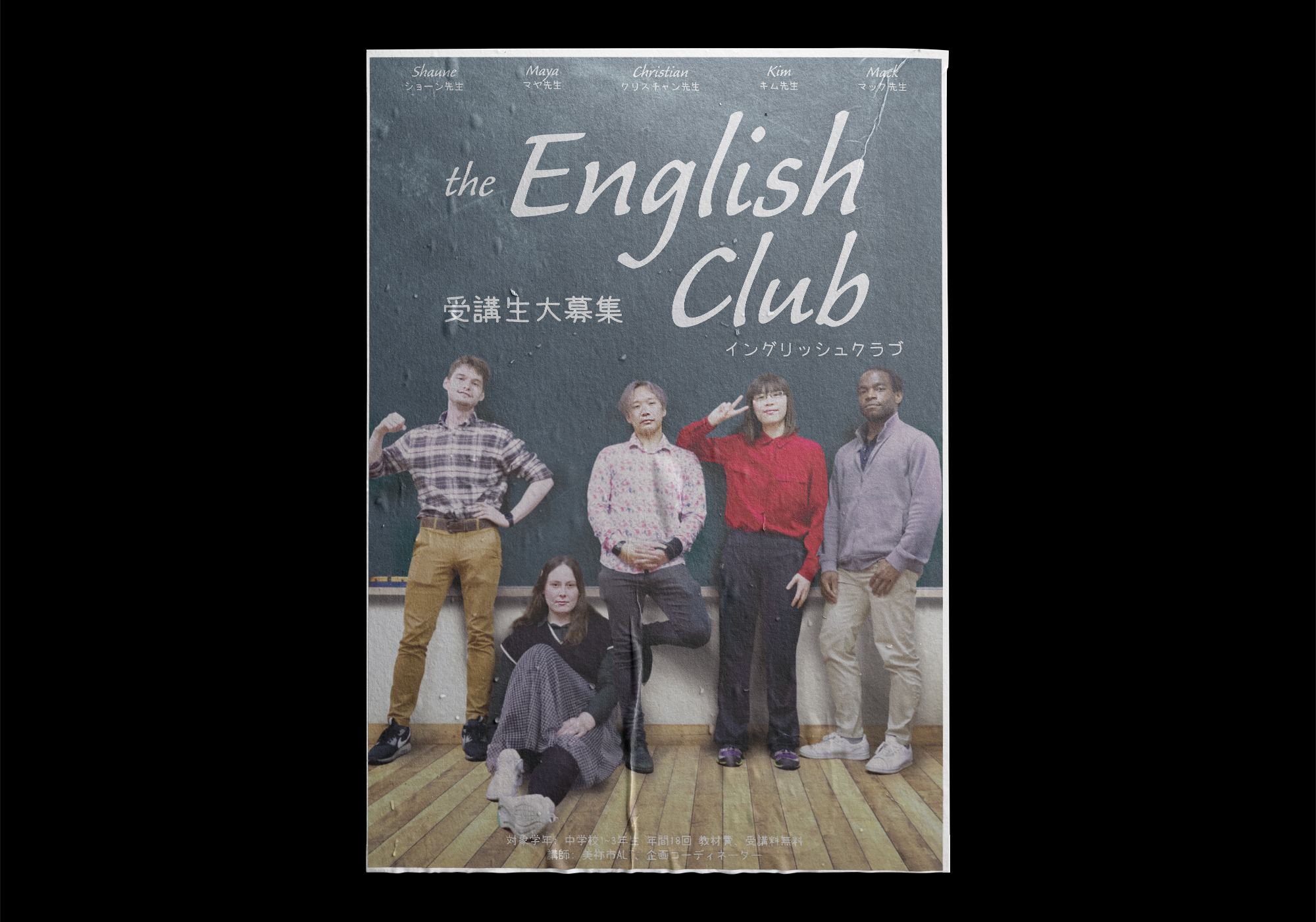
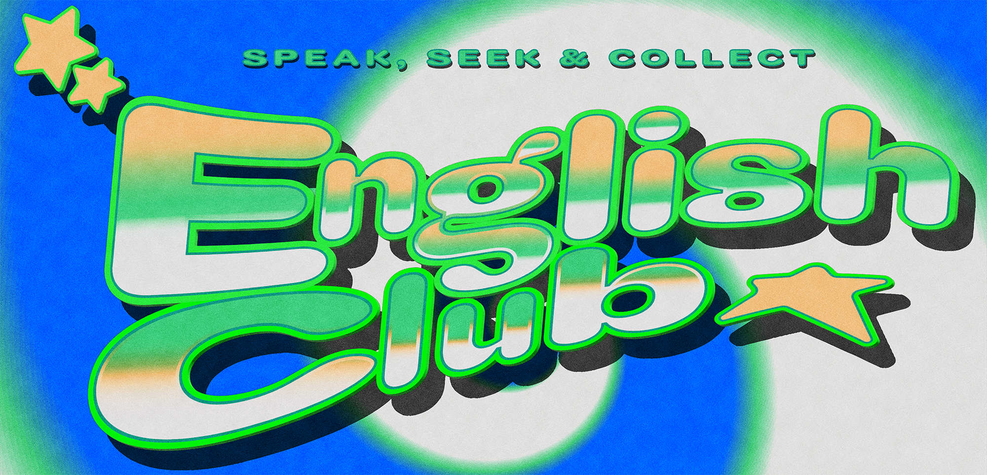
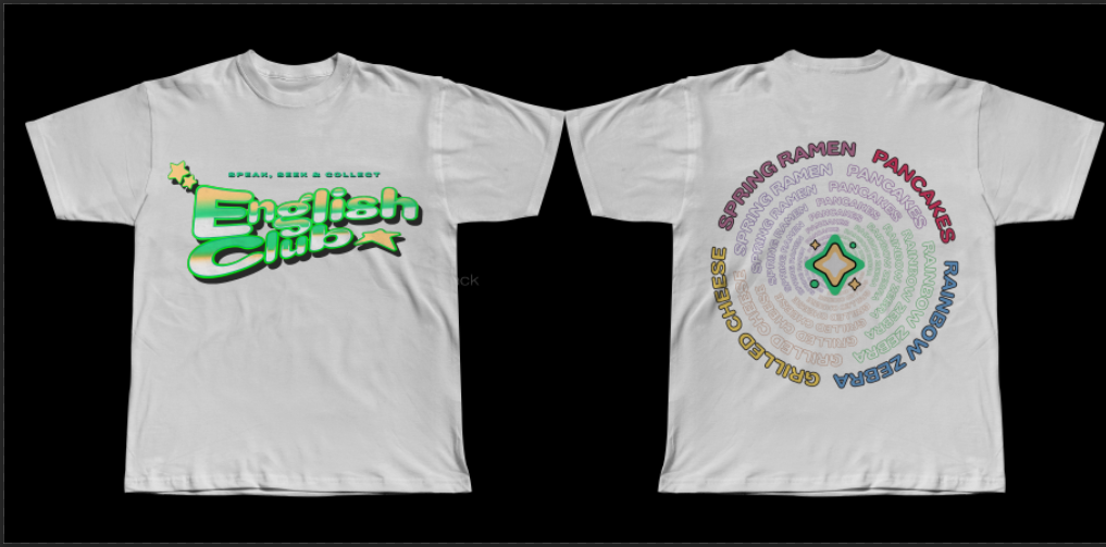
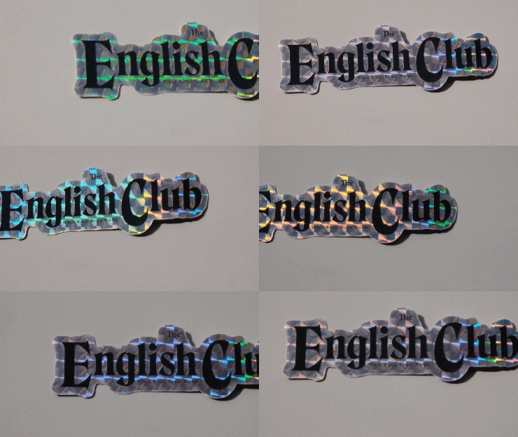
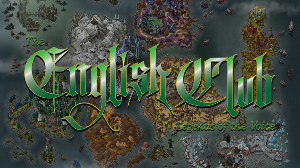
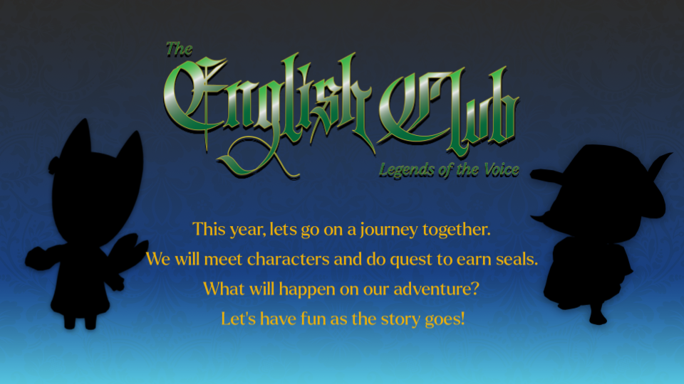
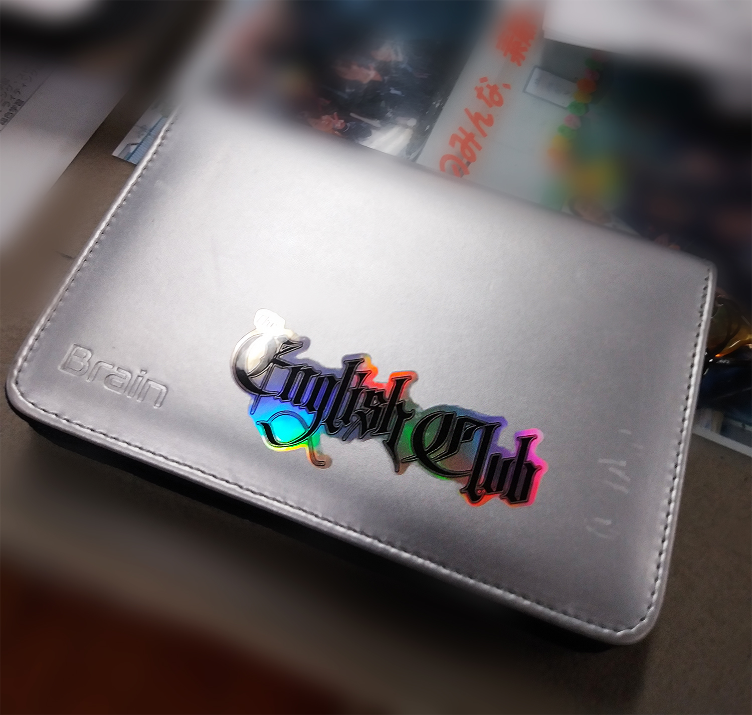
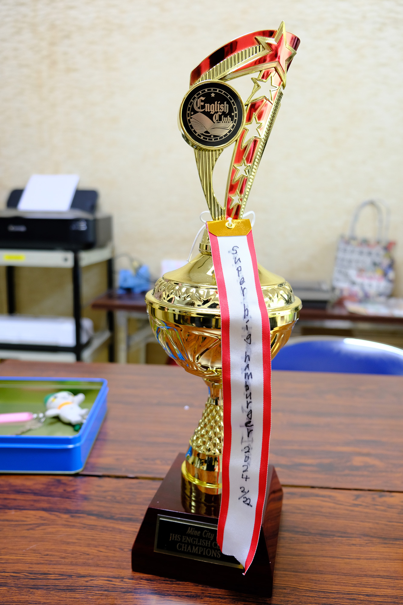
English Club posters were designed like movie posters (Breakfast Club), with bold typography, cinematic layouts, and dramatic lighting to give the club a cool, event-like presence.
Later, for English Village, I created seasonal posters themed around activities like camping and circuses. These leaned into summer camp aesthetics with bright colors, icons, and fun motifs.
Posters were placed in hallways, entryways, and classrooms—and helped create a buzz weeks in advance.



💬 English Board Cultural Posters
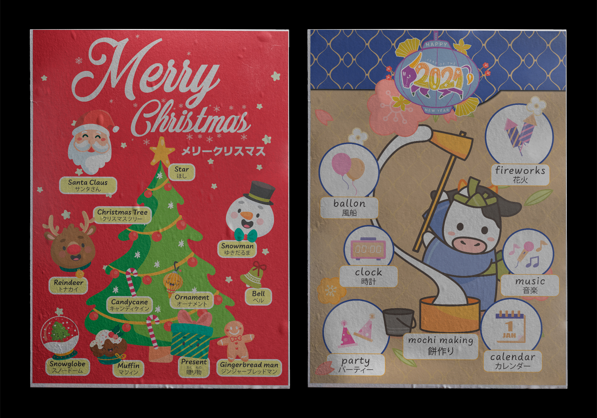
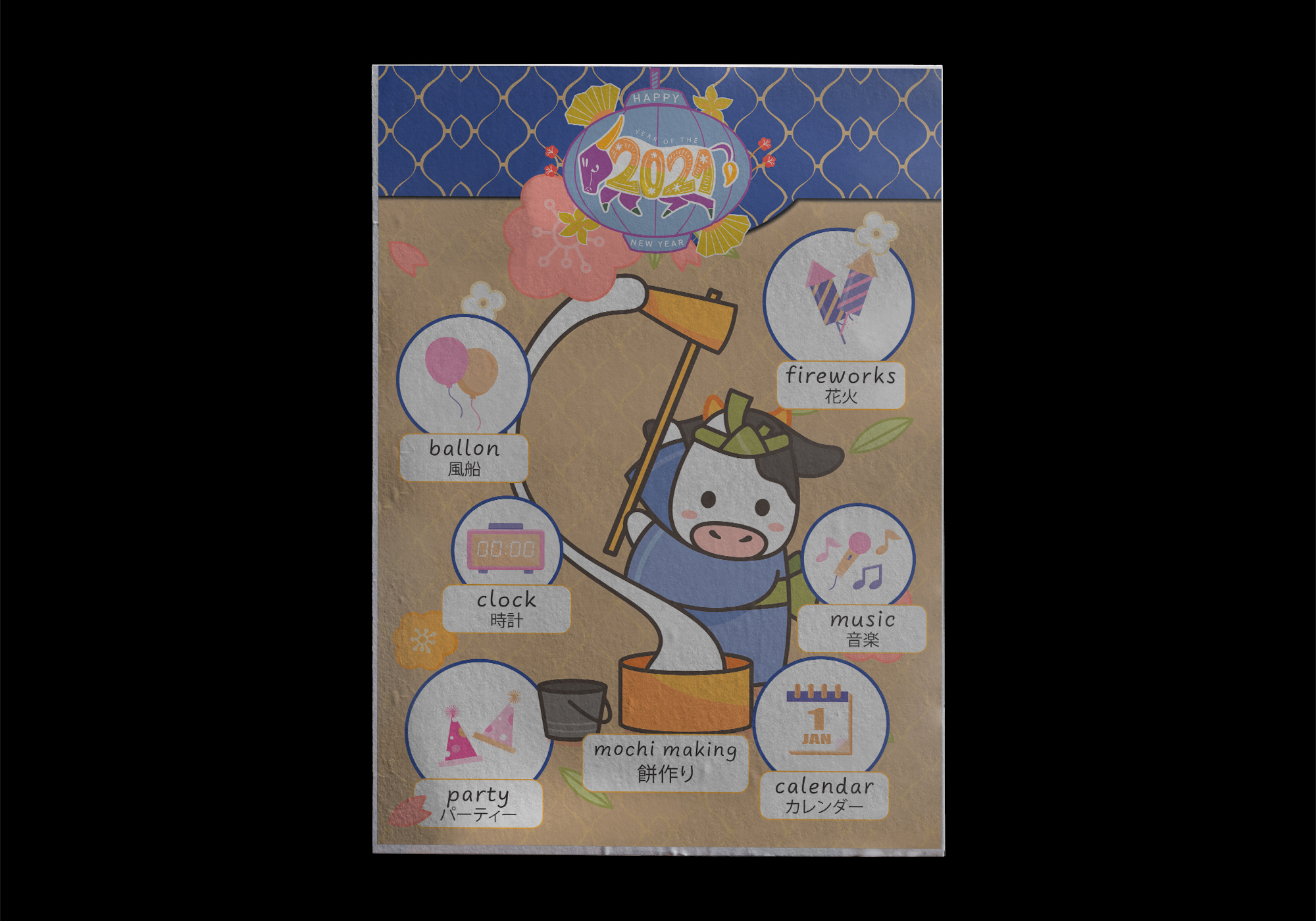
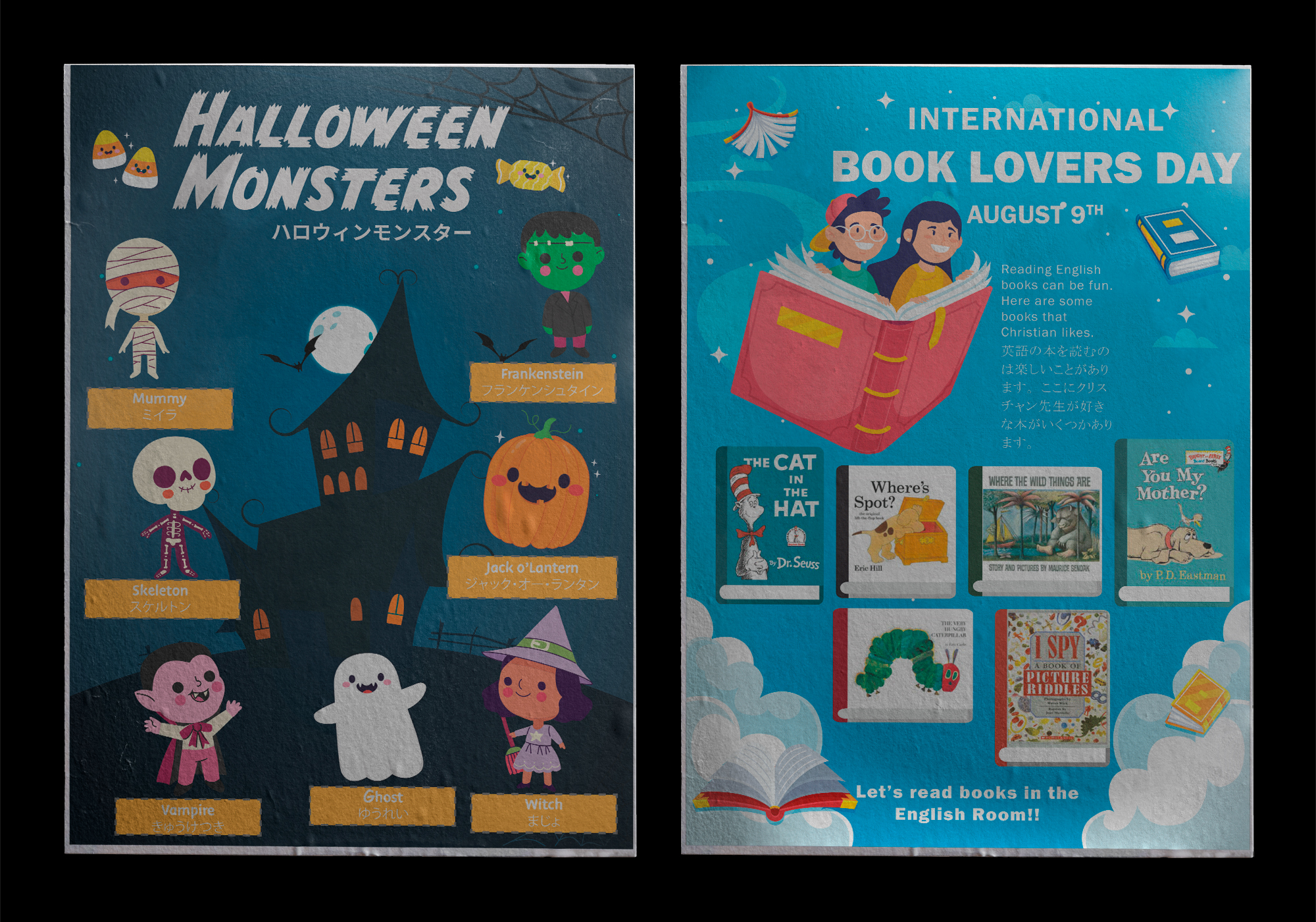
I created a series of cultural posters for the school English Boards, offering snapshots of life in other countries. Topics included holidays around the world, food and family traditions, fun facts and trivia from English-speaking cultures, and personal stories from myself and other ALTs.
These posters helped maintain a visual presence for English year-round, and encouraged spontaneous student engagement, even outside of class.
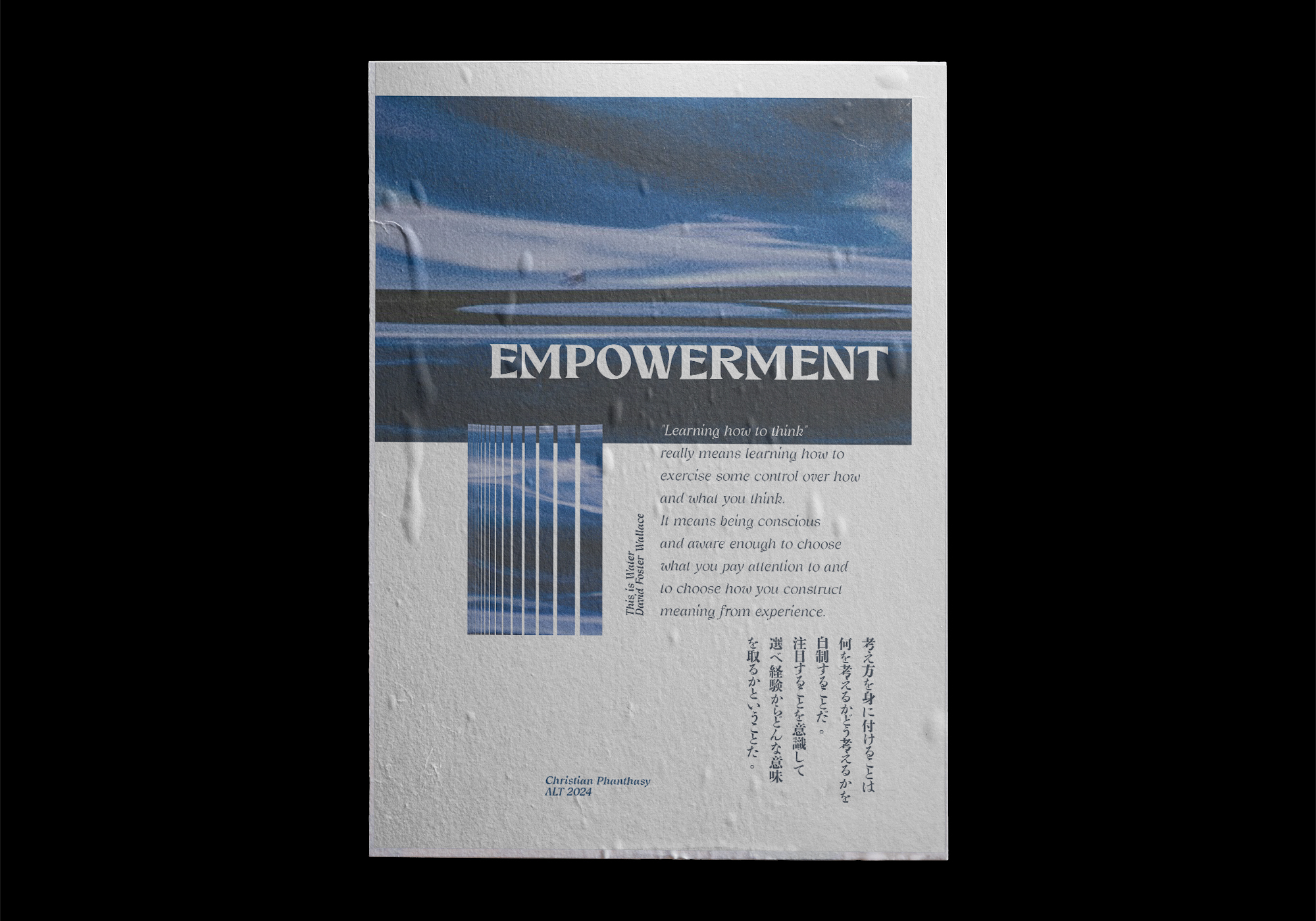
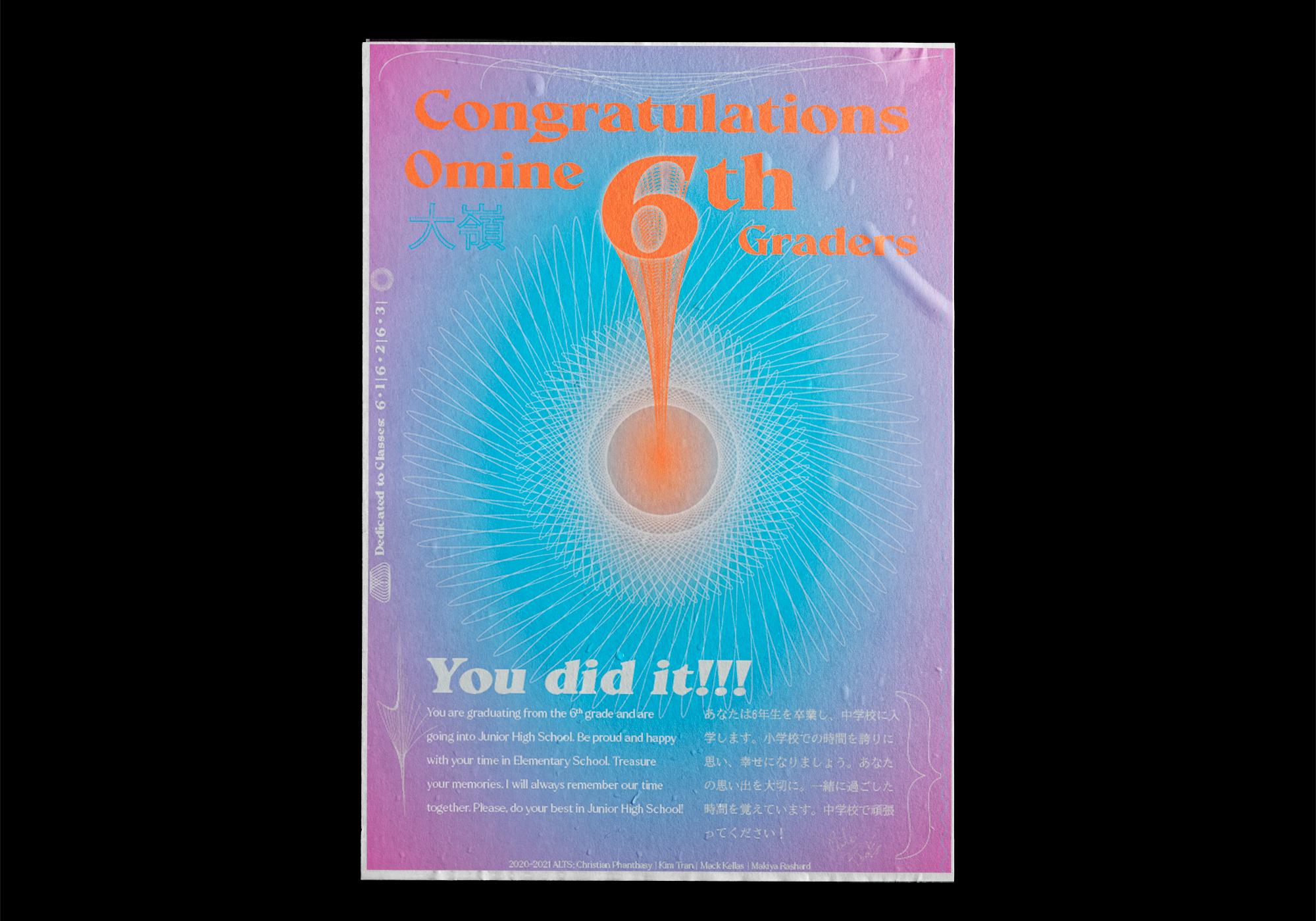
Graduation Posters & Emotional Closure
At the end of the year, I designed personalized graduation posters for students who had regularly participated in English Club or events. These featured:
- Farewell messages from myself including some type of inspirational word and quote
- Highlights from the school year and achievements
- Encouragement to keep exploring English in the future
These posters were displayed near the graduation ceremony area or handed out as a final gift. For many students, they became treasured mementos.
One student told me they hung theirs in their room and wanted to "keep practicing English".

My Role
I led the entire creative direction and production process across my five years in Japan. My responsibilities included:
- Visual concepting and illustration
- Poster and handout design
- Typography and layout for bilingual content
- Feedback gathering and iterative refinement with Japanese staff
- Print production and in-school installation
- Designing for all age levels across elementary and junior high
I also worked closely with Japanese Teachers of English and school administrators to ensure cultural clarity, accessibility, and engagement across all materials.
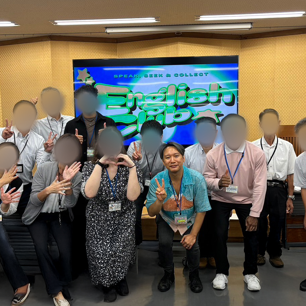
Collaborating with Japanese teachers to refine designs and ensure cultural relevance.
Outcomes & Impact
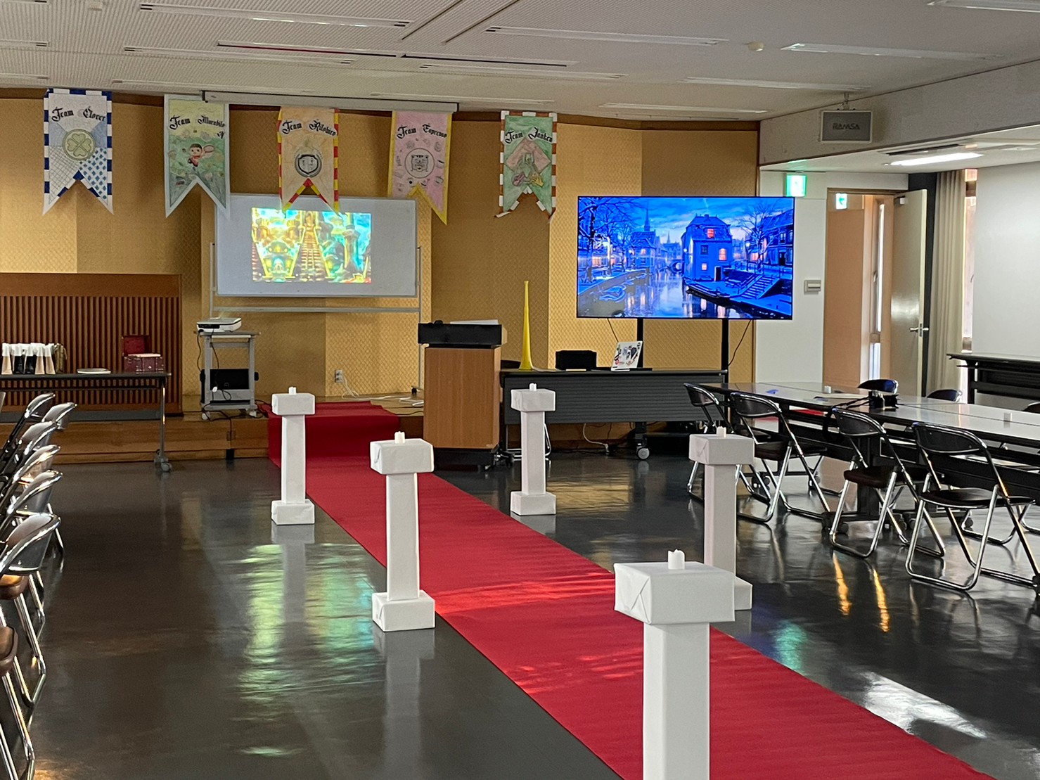
Project Gallery
A selection of key designs from different English Events:






Reflections & Learnings
This project provided valuable insights into the power of design in educational contexts:
This wasn't about branding a product—it was about branding a subject. Through design, I gave English a visual identity that students could recognize and connect with.
Design became a cultural bridge. It helped students feel something for a language they had often only encountered in books and tests. It gave them a reason to care—and more importantly, to choose to participate.
Key Takeaways
- Visual storytelling is a powerful tool for changing perception, even in education
- Design that taps into cultural reference points can spark interest across language barriers
- Small, intentional branding choices can make large impacts in engagement and participation
- Education benefits deeply from emotionally-driven, student-centered visual design
